Using the report tables
The Atrilyx report tables provide an advanced user experience, allowing the user to view and organize the data they are analyzing exactly as they desire.
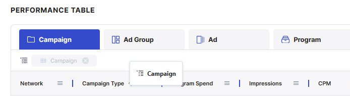
Grouping
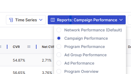
Attribute columns can be “grouped” to see a sum of activity for that attribute for the given data range. We have provided a number of preset groups available via the “Reports” dropdown
To create your own grouping, simply drag/drop the attribute column header to the “group” bar to pivot the data for that element. Multiple levels of grouping are supported.
Filtering
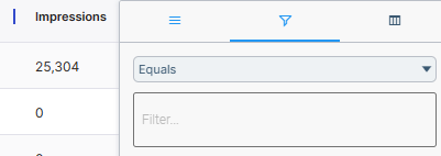
You can filter your data on the tables in two ways:
Click on the “hamburger” on any column, the second tab will show options to search through and filter your data.
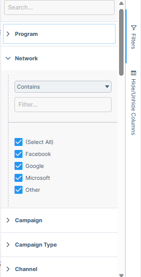
Click on the filter menu on the right and get a full list of columns and filter options as well as select boxes to check off what you want to see.
Selecting Columns
You can select the columns you want to see in two ways:
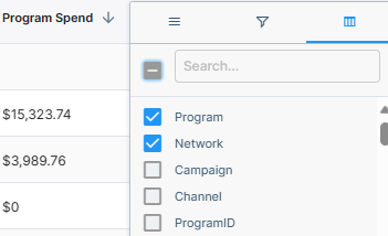
Click on the “hamburger” on any column, the third tab will show a list of columns to show/hide.
Click on the right side bar to open the full column menu. From here you can enable pivot mode, select/deselect columns, and drag to change their order.
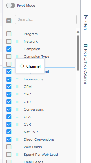
Pivot Mode
By default, when grouping attribute columns, other attribute columns will appear in the table as empty columns until you expand the group. By enabling pivot mode, those columns will be hidden from the table.
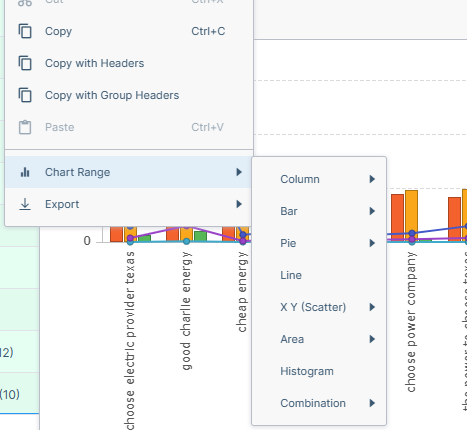
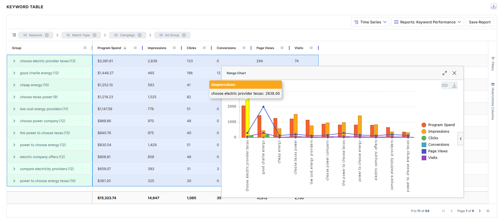
Creating Charts
Our tables allow the user to create their own charts. Simply select the data points you want to look at and right click to select the chart you want. Many chart types and color themes are available.